Très Lumineux — branding and creative direction by Indigo Estudio, Mallorca
A logo that lights up
The aim behind Très Lumineux’s visual identity was to create a logo that embodies the brand’s delicacy and class. The
The logo features a stylised window with rays of sunlight filtering through it, symbolising the light and clarity we bring to
each space. The concept behind the logo is profound and meaningful. The window represents openness, transparency and connection
between the interior and the exterior. The sunbeams streaming through the window symbolise enlightenment and rebirth, ideas
key elements in the interior design they seek to promote. This emblem not only alludes to the name, which in French means
«very bright», but it also reflects our mission to illuminate and enhance every project.
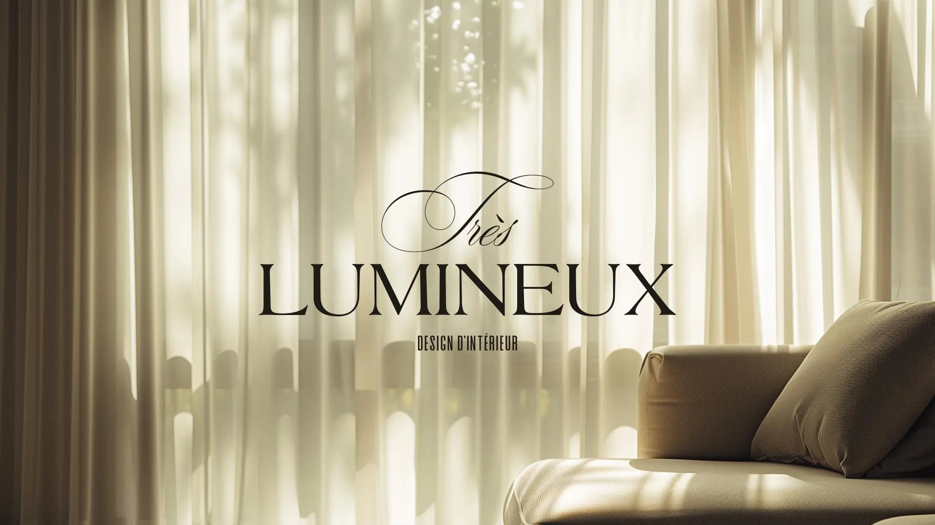
Elegance in every letter
We have carefully selected a combination of two typefaces that complement each other perfectly to represent our brand. The first typeface, with its clean and sophisticated lines, evokes a sense of modernity and class. The second, with a softer, more traditional feel, adds an element of warmth and approachability. This duality in the typefaces reflects our ability to blend the contemporary with the classic, creating a harmonious balance in all our designs.