Bodega 65 — branding and packaging design by Indigo Estudio, Mallorca
Mallorcan culture in every bottle
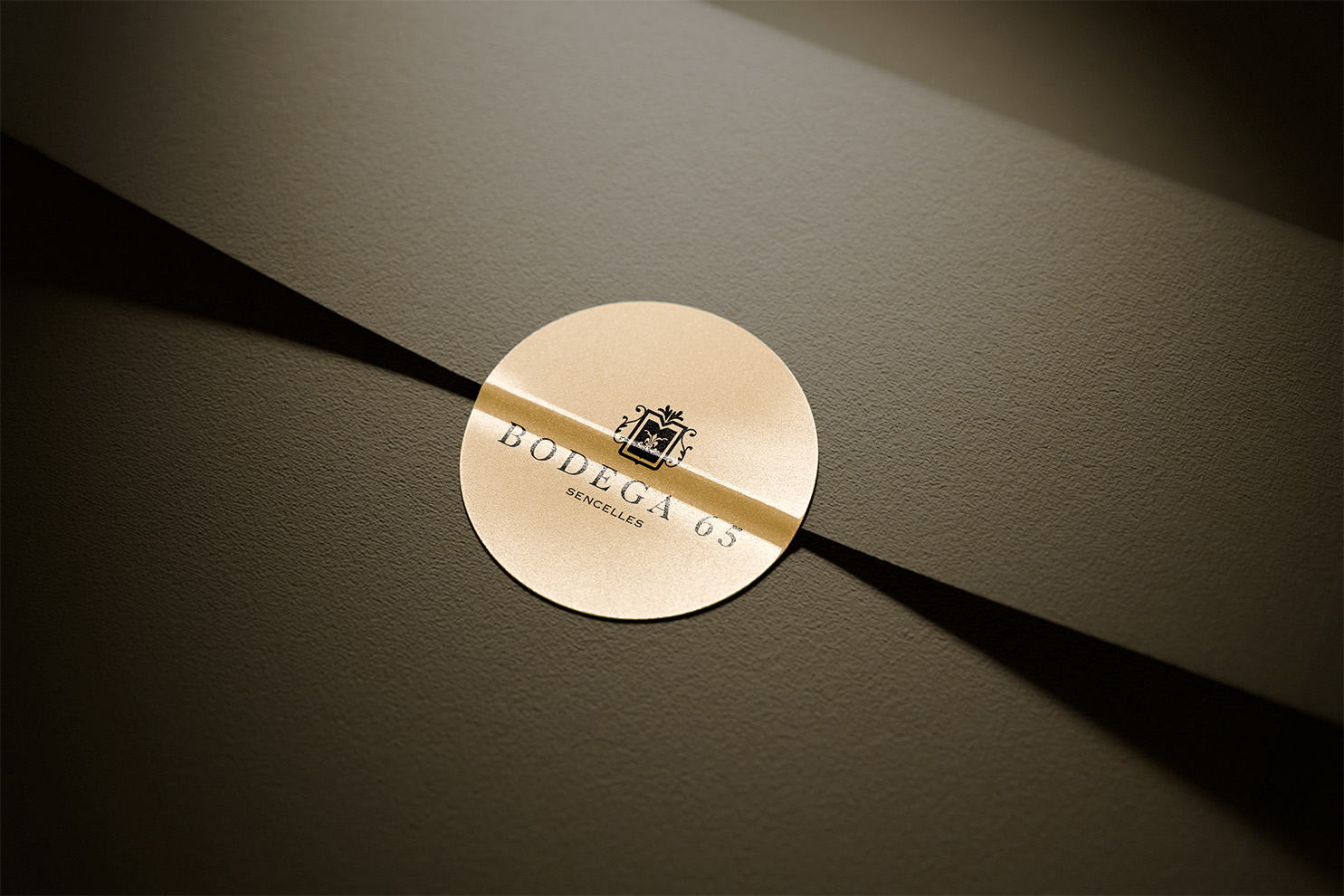
Every element of the design speaks to the connection between the land, the wine and Mallorcan culture. The puput, which features in the design, is much more than a visual symbol; it represents a fragment of the very essence of Mallorca.
This bird, renowned for its beauty and uniqueness, was chosen to reflect authenticity and a connection with the natural environment. The labels were designed with an approach that combines elegance and minimalism, leaving room for the story of the wine and the winery to shine through. The textures and finishes are a nod to the artisanal process that characterises the wine’s production.
A visual tribute to wine
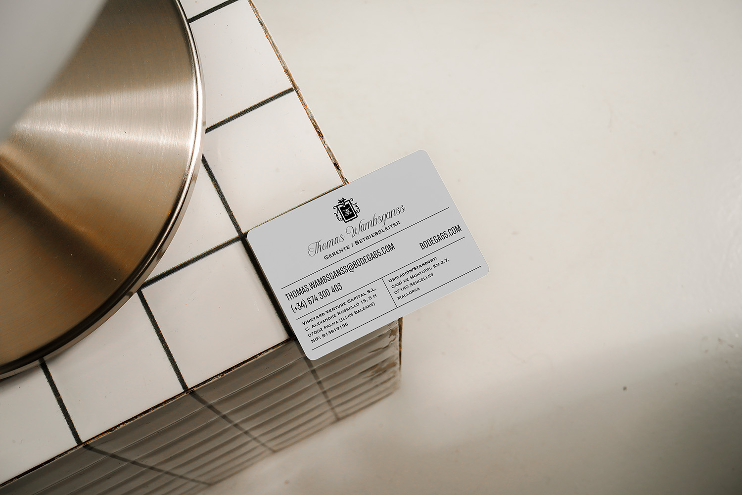
The design was conceived to convey exclusivity whilst also evoking warmth and a connection to the land. When looking at the labels or business cards, the aim is for the first impression to be one of sophistication linked to the authentic character of Bodega 65.