Dad’s Journal — graphic design, visual identity and layout by Indigo Estudio, Mallorca
Dad’s Journal
Aim of the project
Design a premium printed journal that would combine:
- A minimalist, understated and masculine graphic style.
- A clear structure that is easy for the user to follow.
- High-quality materials that enhance the writing experience and the product’s durability.
Design process
- Visual identity: a selection of typefaces and a graphic system that convey strength, calm and purpose.
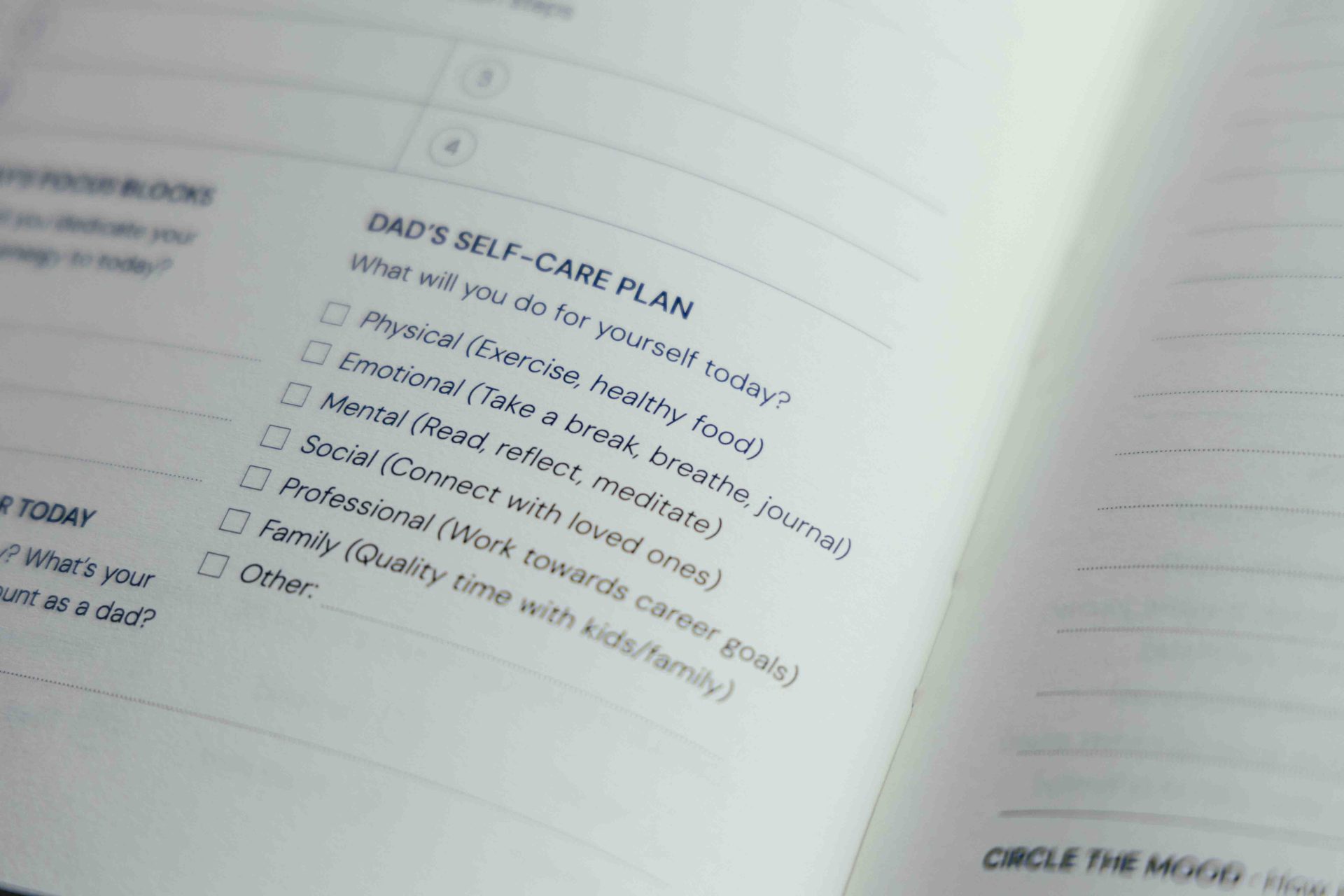
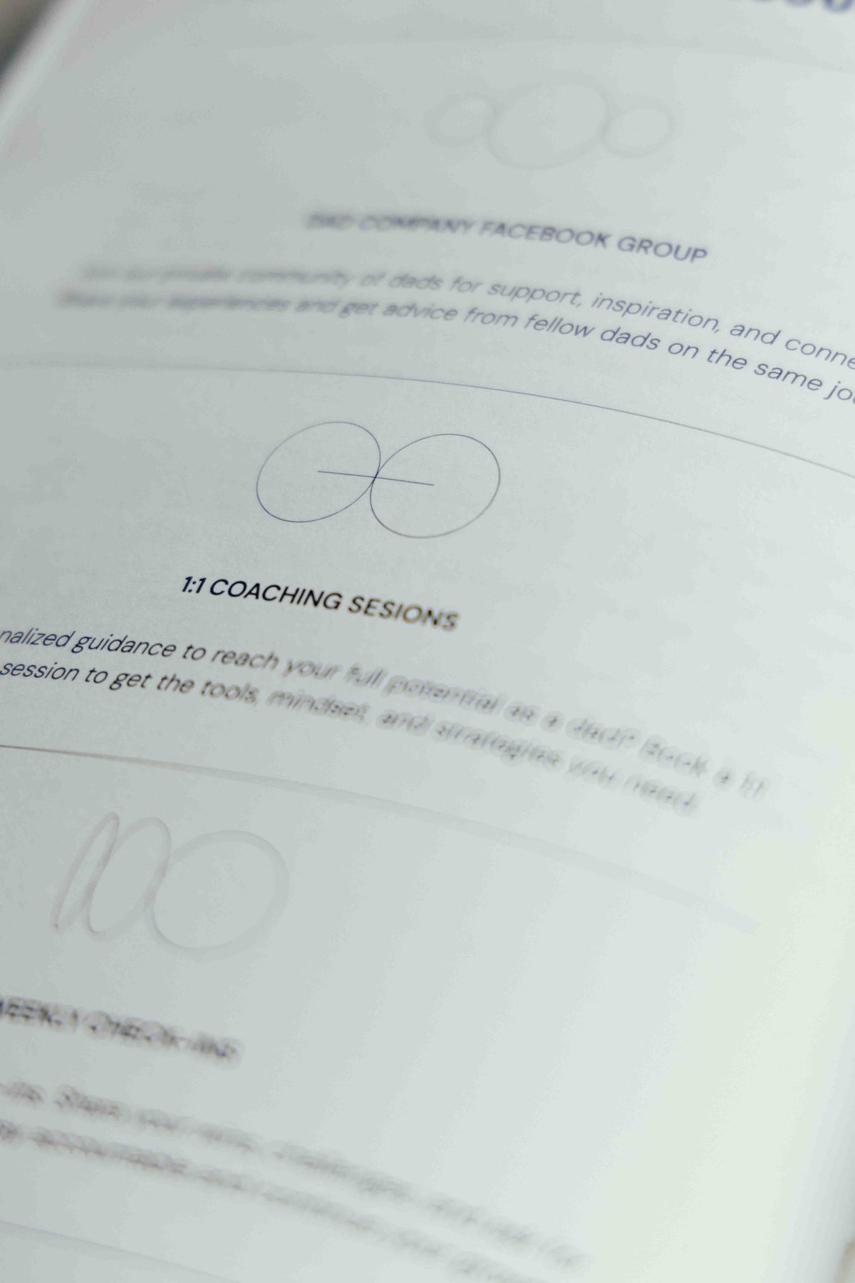
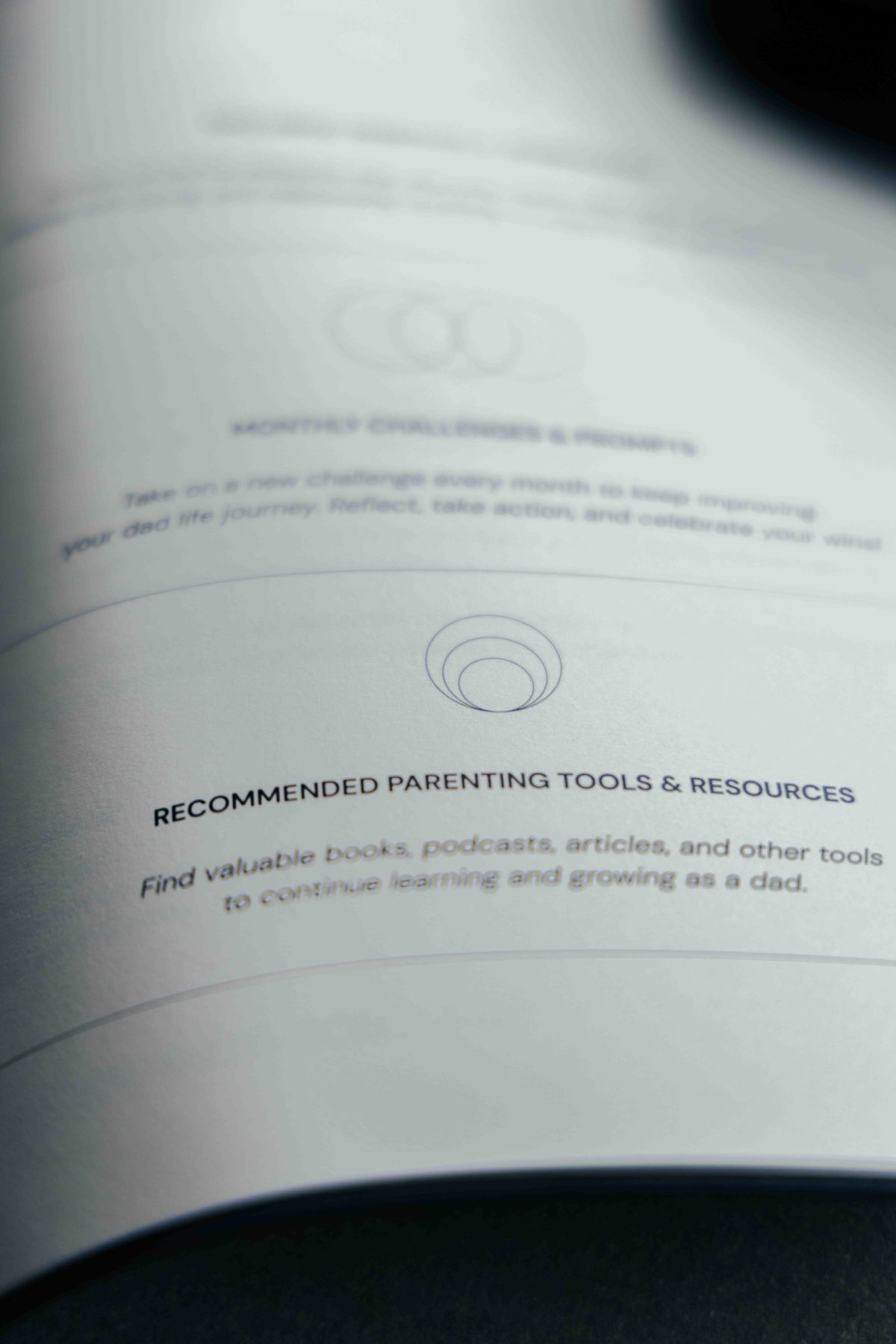
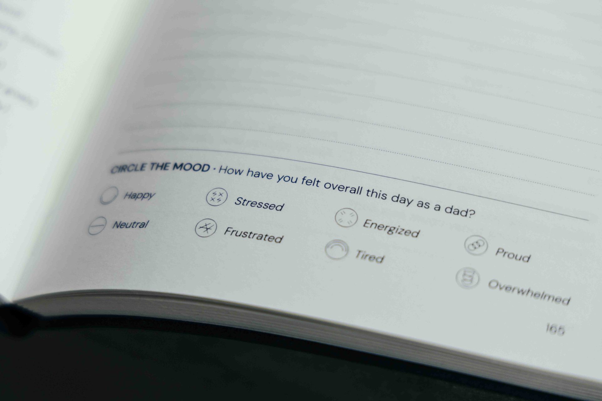
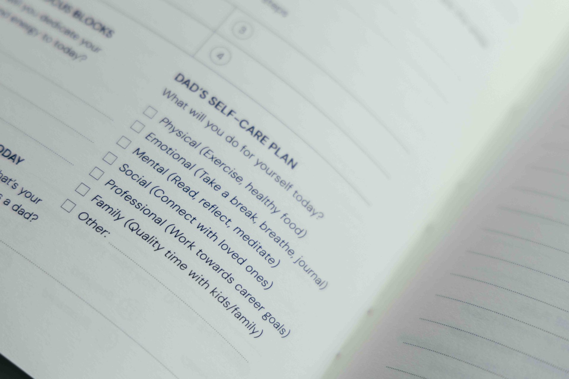
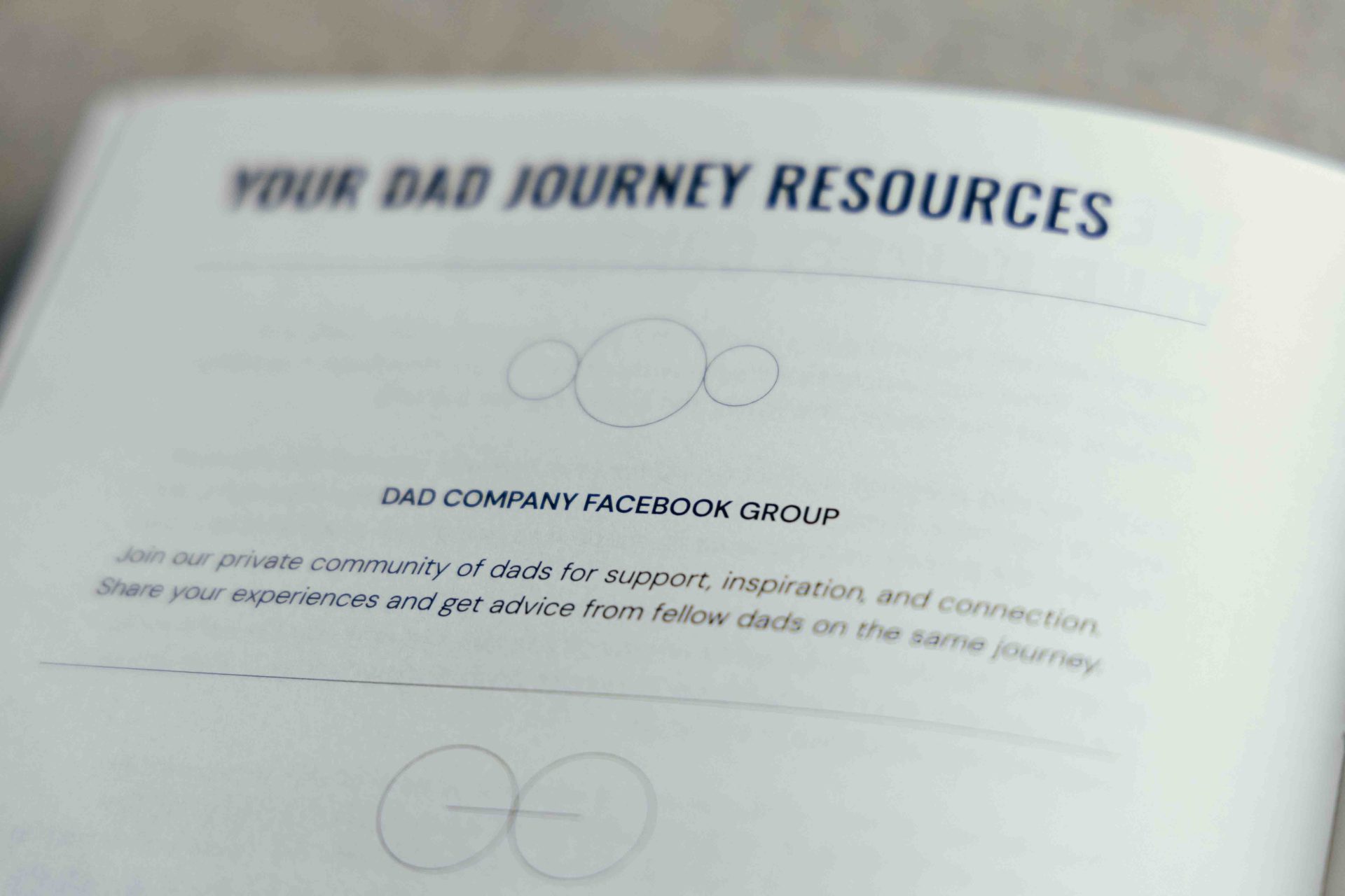
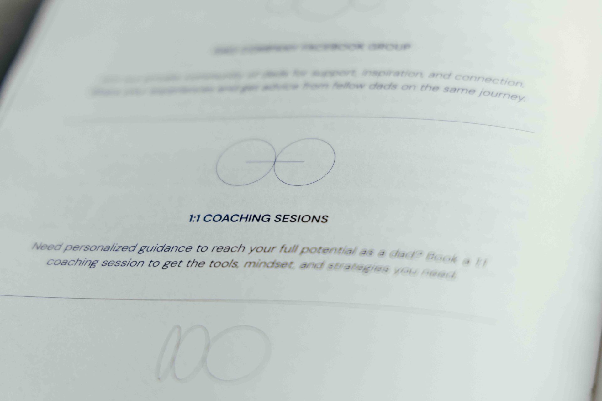
- Layout: a modular structure featuring prompts, reflections and free-writing pages, designed to provide step-by-step guidance without being overwhelming.
- Selection of materials: heavyweight paper designed to accommodate different types of ink, a premium-feel cover and durable binding.
- Graphical details: subtle symbols and illustrations (spirit animals) that reinforce the journal’s narrative.
Result
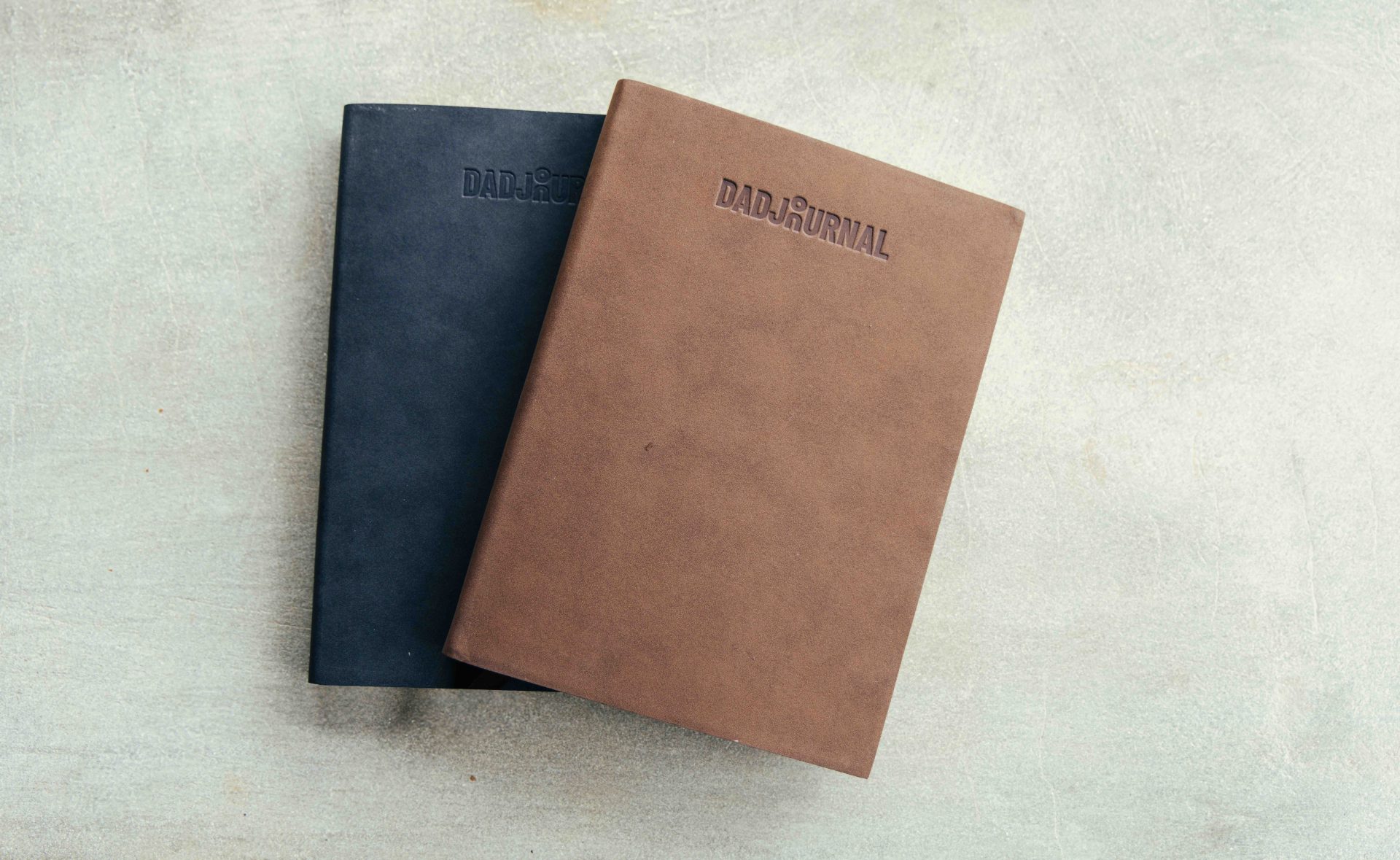
The end result is a a 272-page journal, with no set dates, so you can start at any time of the year.
Key features:
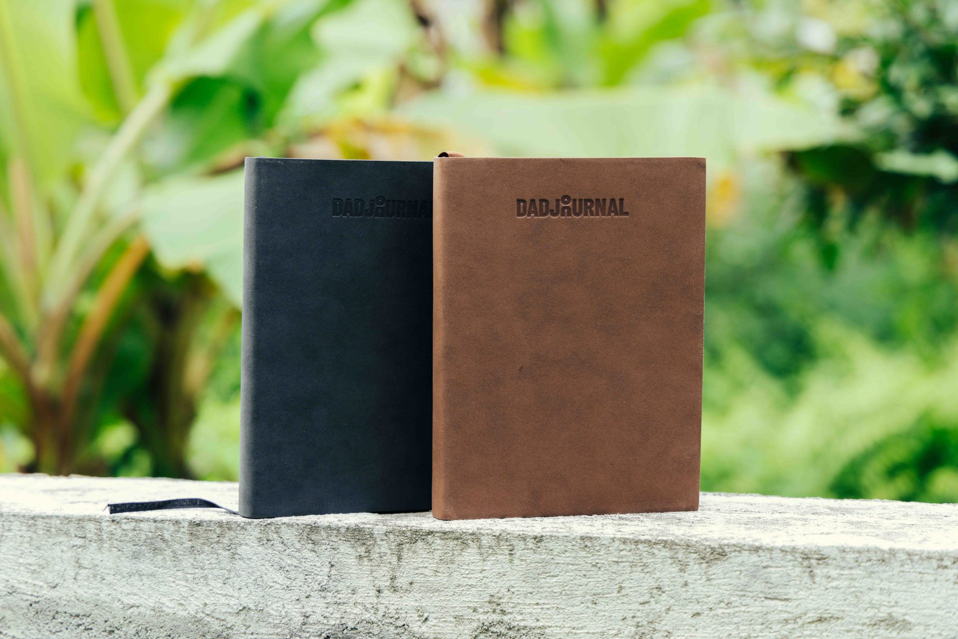
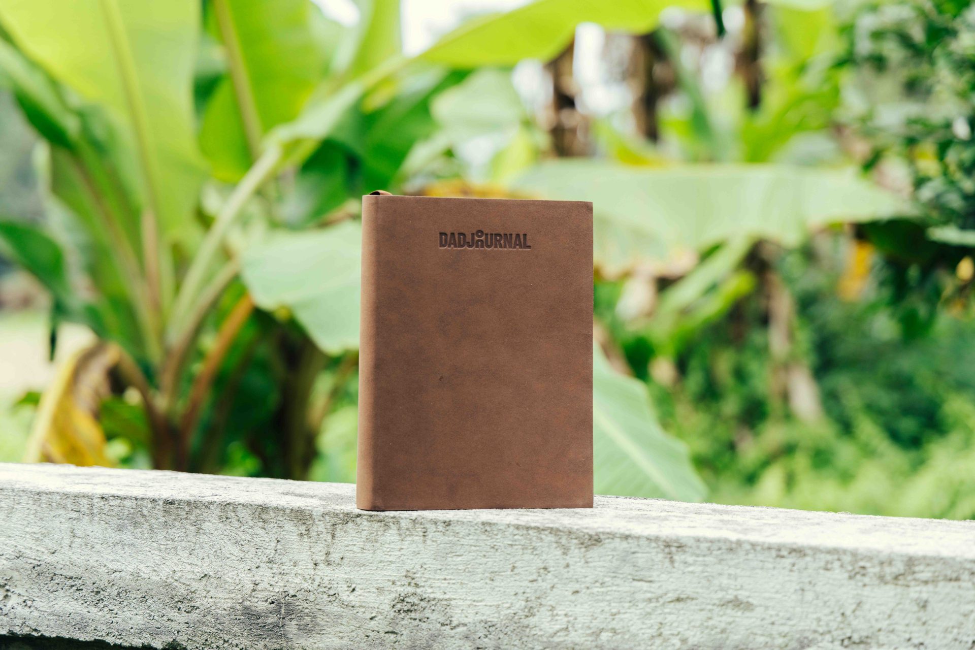
- Hardback binding with premium finishes.
- 120 gsm paper, bleed-free.
- A handy size (A5) to carry around with you.
- A timeless design, conceived both as a functional object and as a piece that preserves memories.
You can visit the website at dadsjournals.com.
More projects:
See all