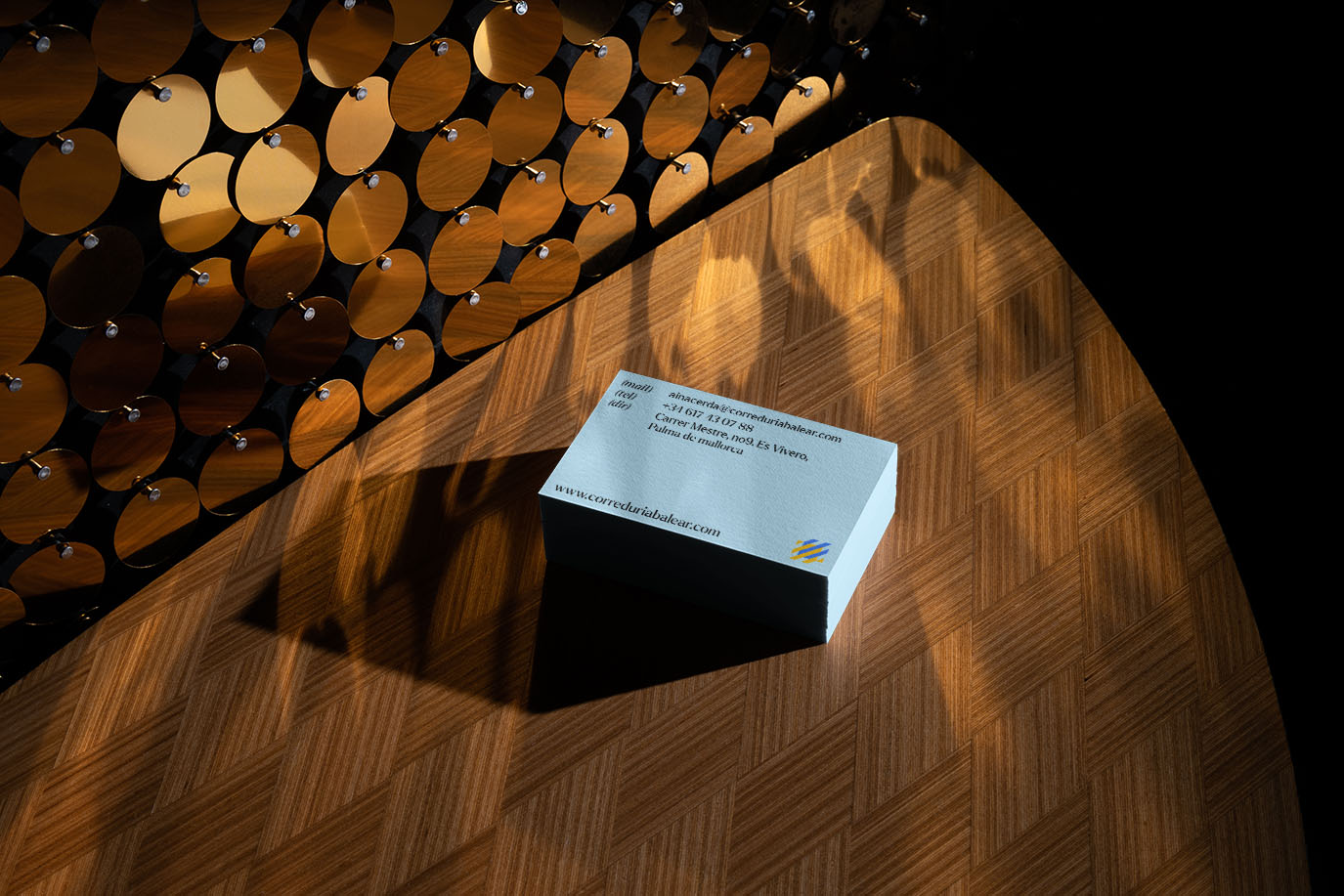
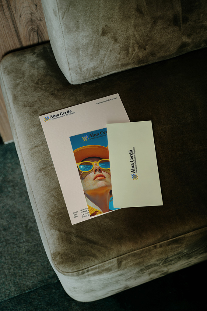
Correduría Balear de Seguros — branding and graphic design by Indigo Estudio, Mallorca
A symbol of trust and professionalism
The Correduría Balear de Seguro logo is a modern and sophisticated representation of security and stability. Using a combination of geometric shapes and solid colours, the logo conveys strength and reliability. Shades of blue and mustard predominate, evoking trust, peace of mind and transparency – essential qualities for an insurance brokerage.
Visual Impact
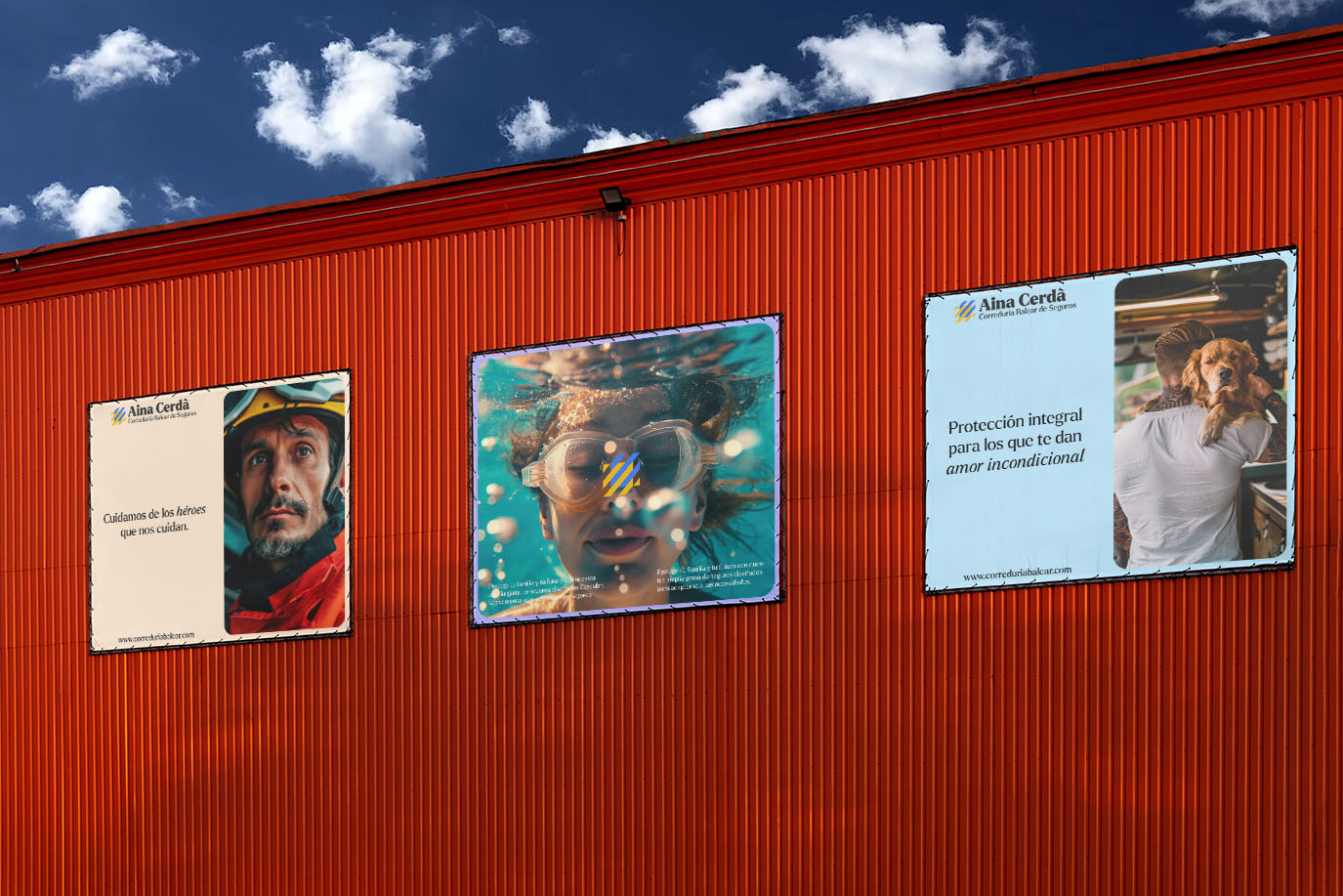
The signage designed for Correduría Balear de Seguros is characterised by its clarity and visual appeal. Each sign is an extension of the brand identity, consistently using the colour palette and typefaces selected for the logo.
The clear and organised presentation of information ensures that key messages are easy to read and memorable, capturing the audience’s attention and reinforcing the brand’s identity.
Website Functionality and Aesthetics
The website design for Correduría Balear de Seguros is a prime example of how aesthetics and functionality can work together. It features an intuitive and visually appealing interface, with straightforward navigation that allows users to find the information they need quickly. Consistency with the brand’s overall graphic design is maintained through the use of the logo’s colours and typefaces, whilst high-quality images and graphics add a touch of professionalism and trustworthiness.