Alchemy Bartending School — branding and graphic design by Indigo Estudio, Mallorca
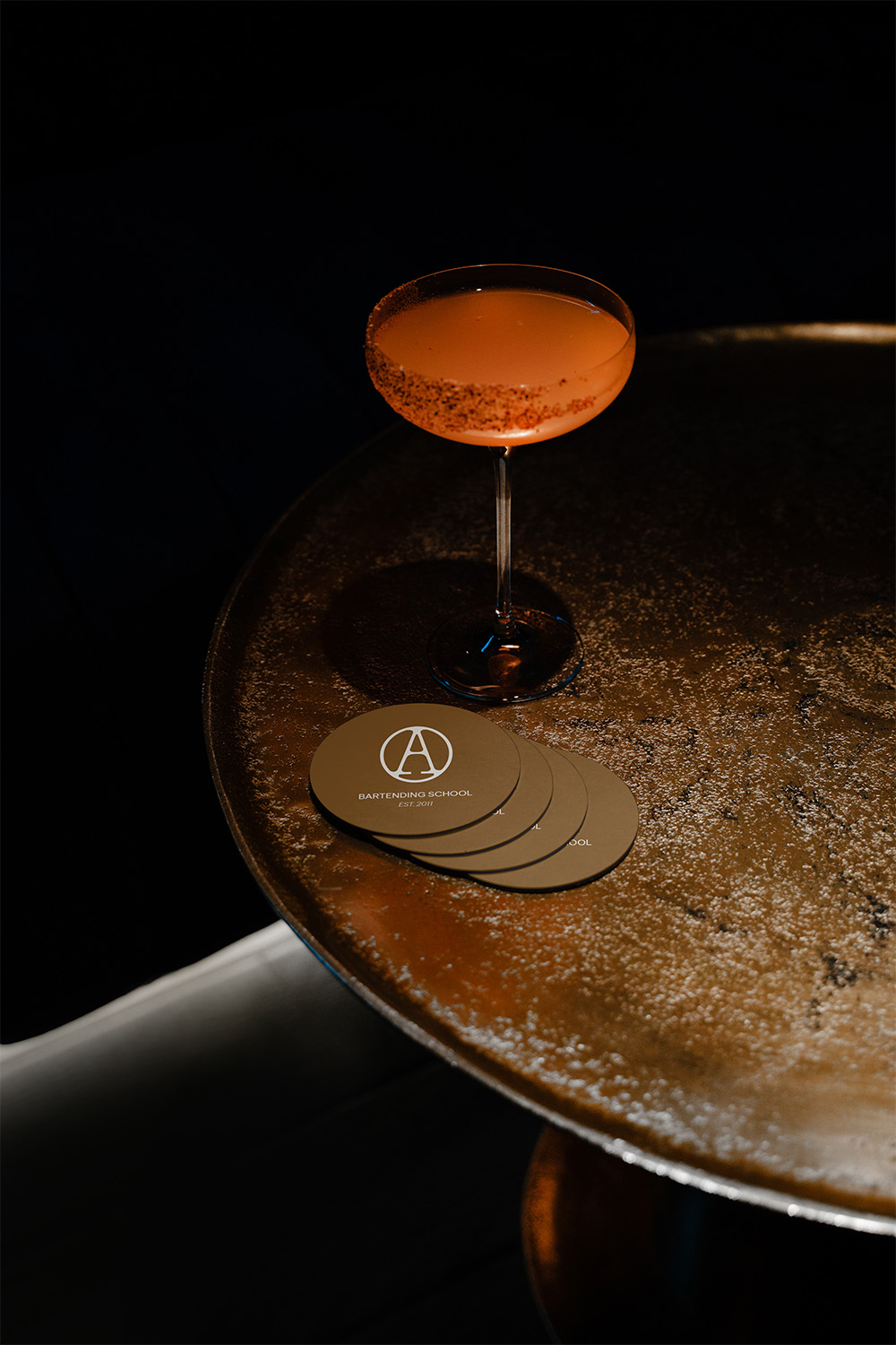
Alchemy has been transforming people through bartending for over a decade. But its visual identity did not live up to that ethos. The brief was clear: to build a new brand from scratch, capable of embodying everything the school stands for with the same conviction.
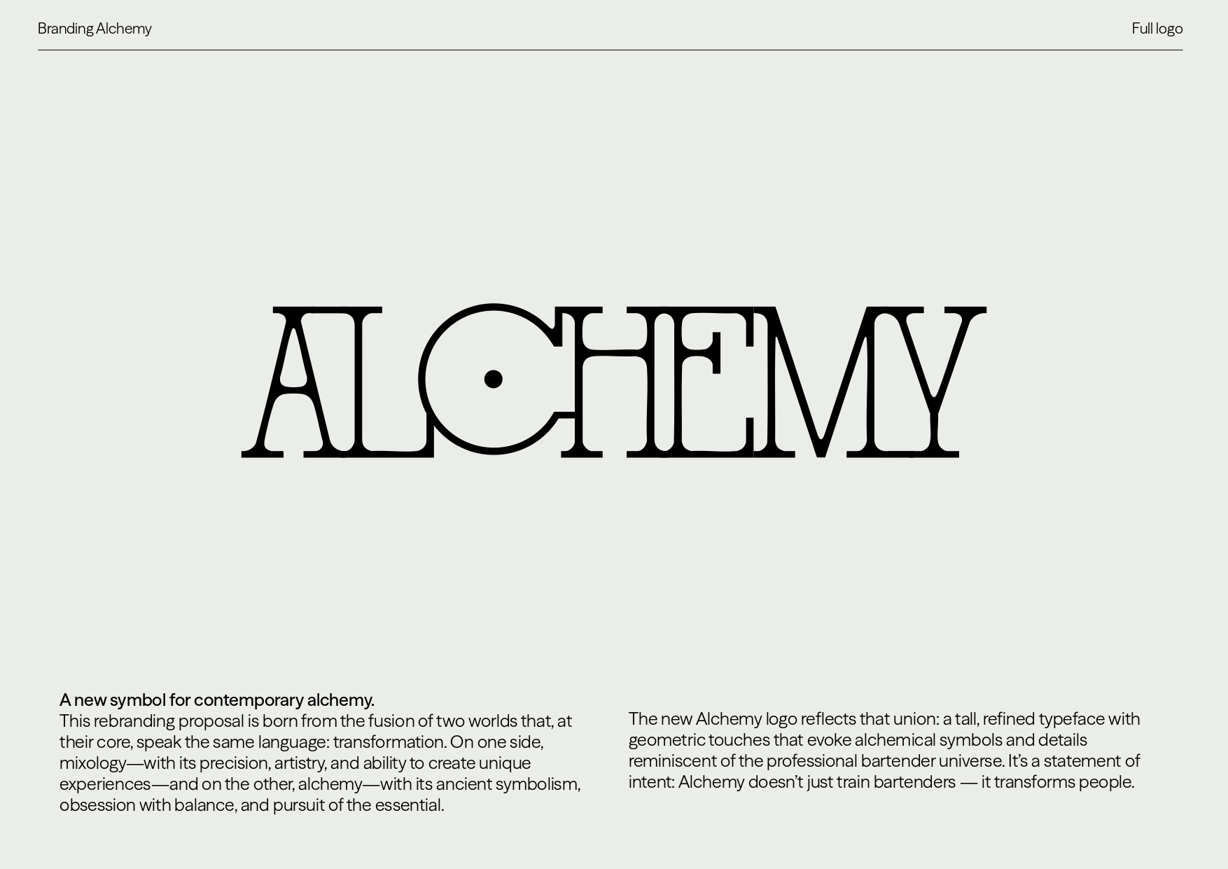
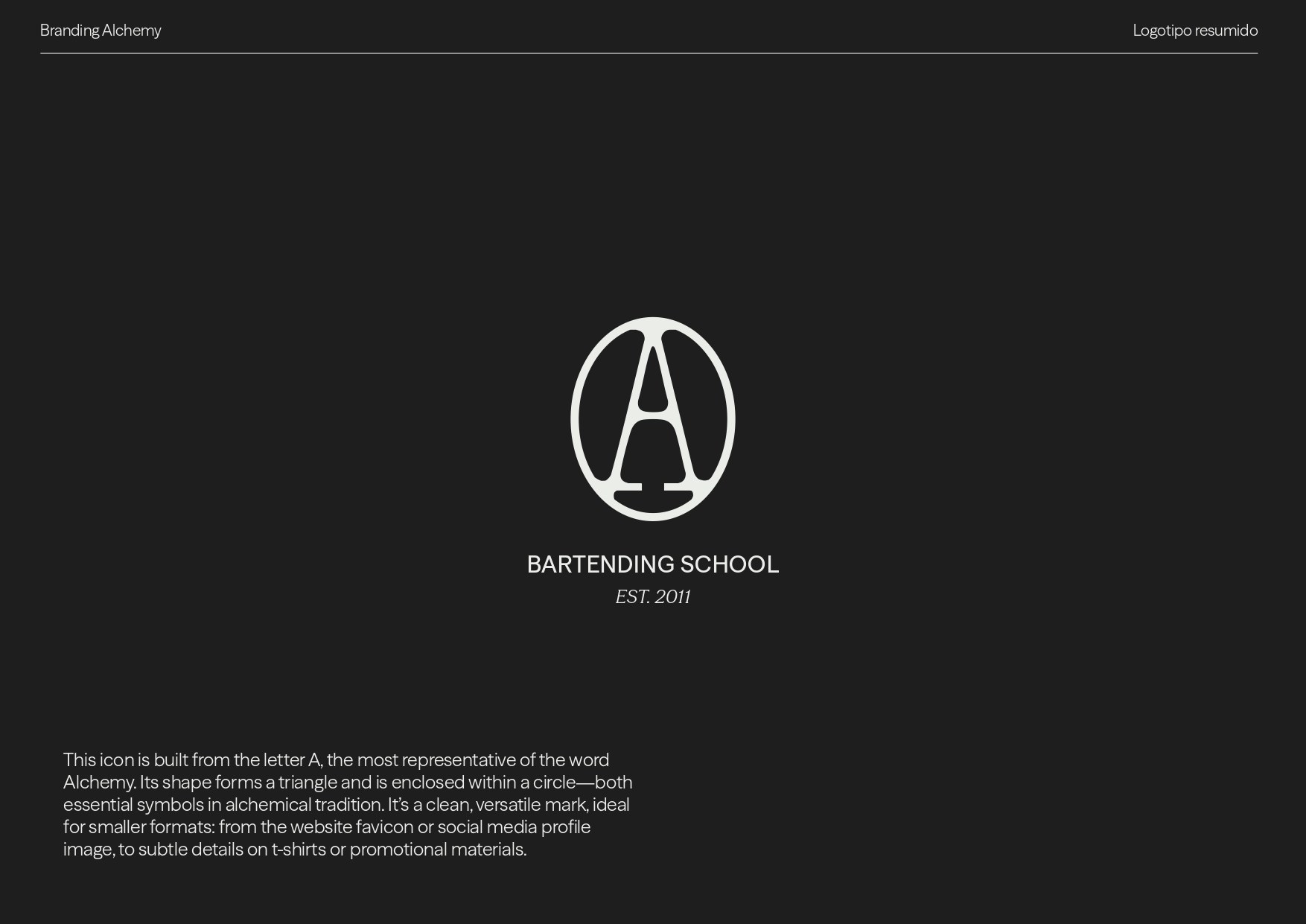
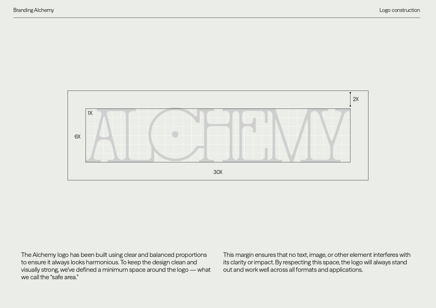
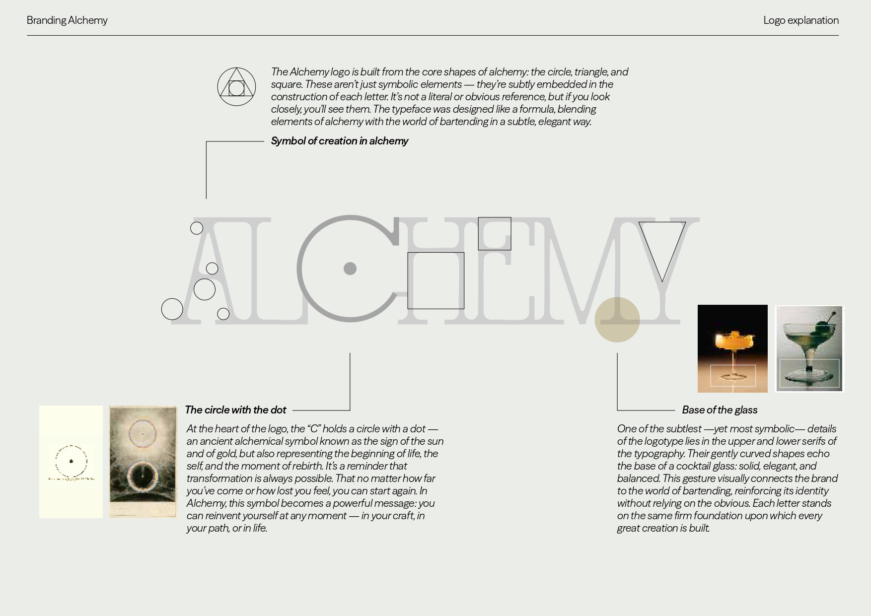
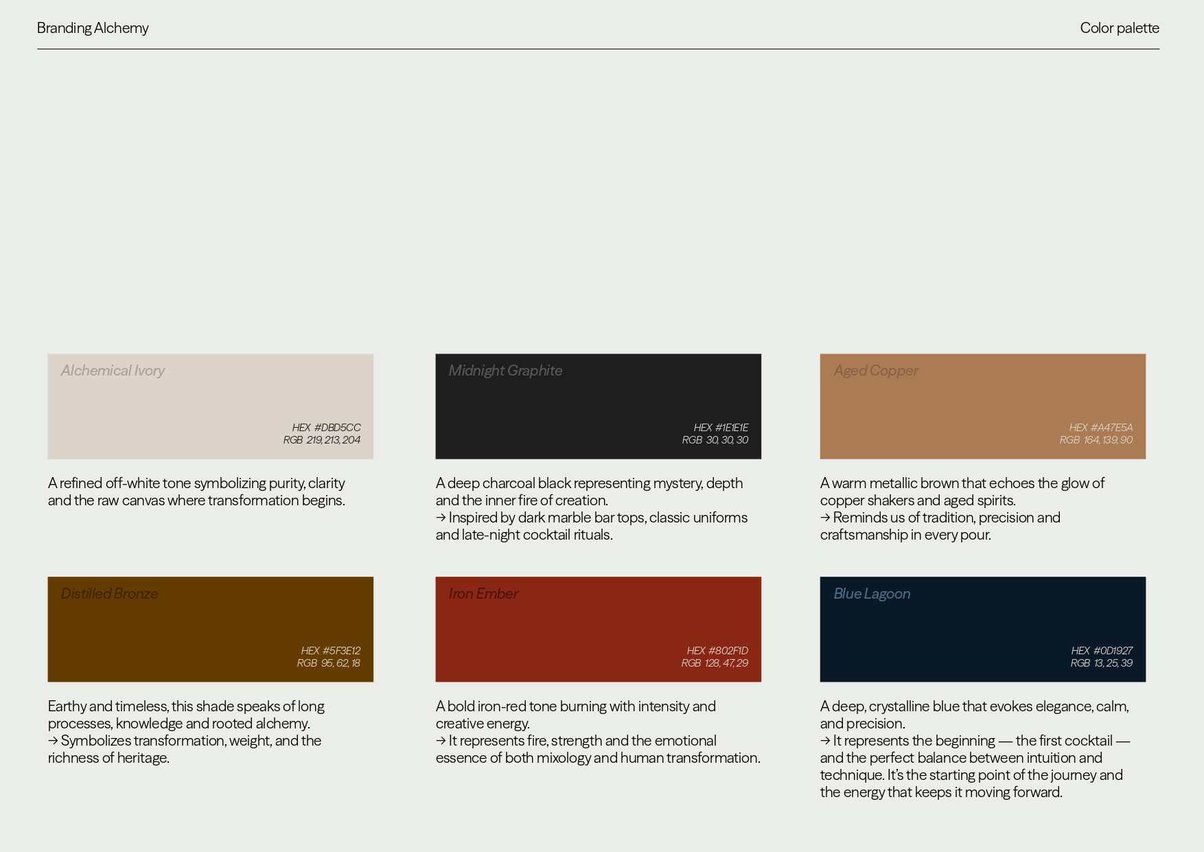
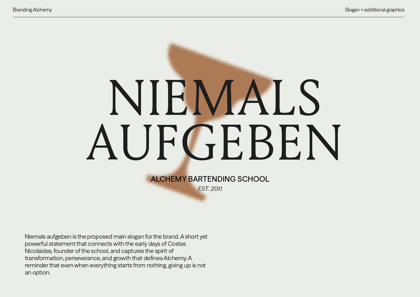
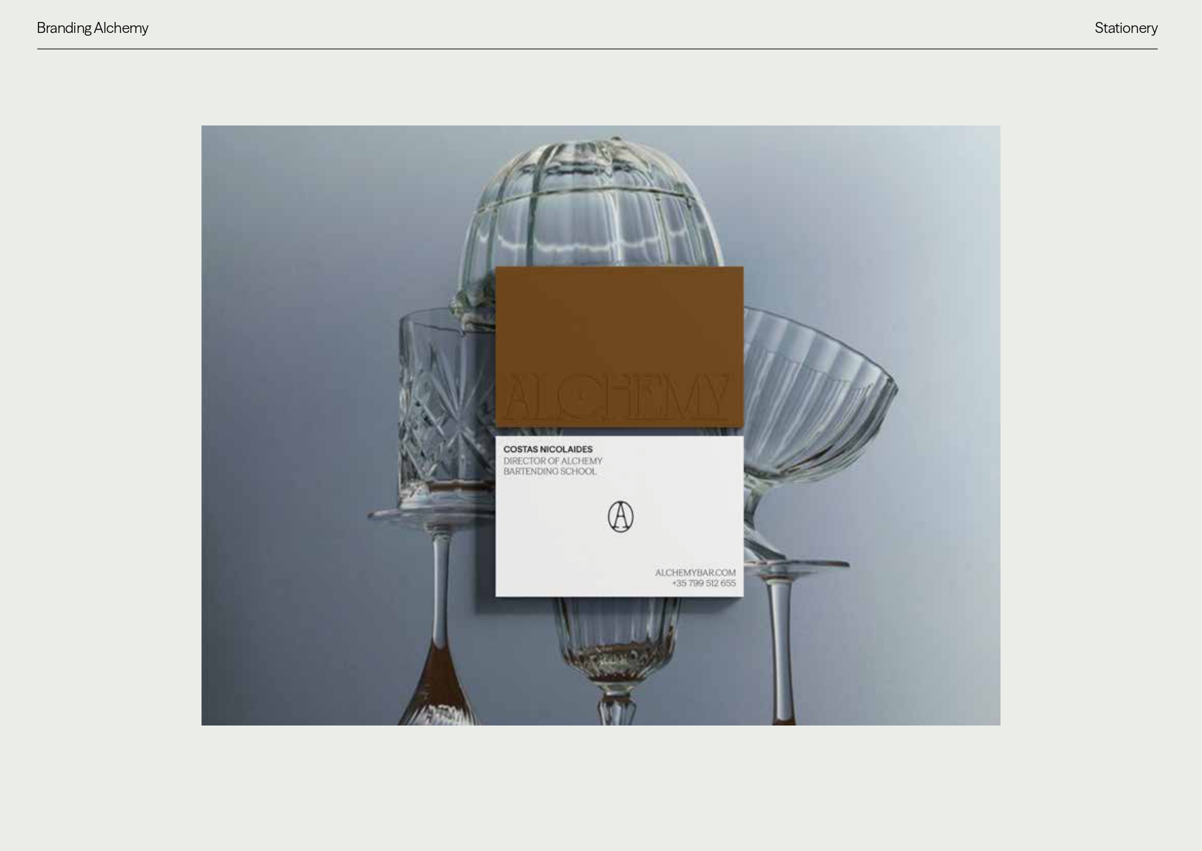
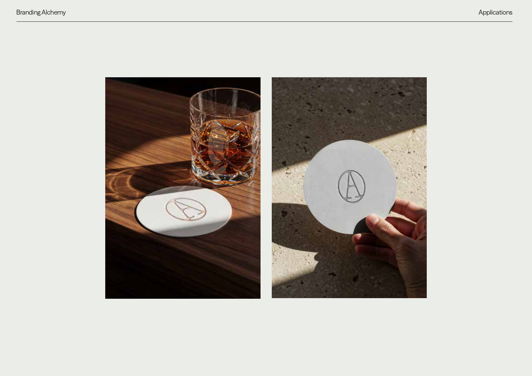
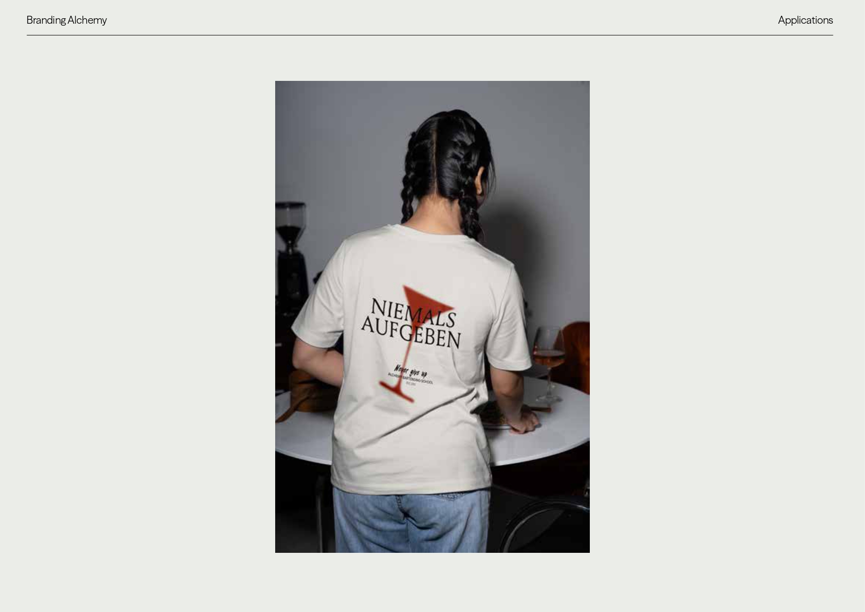
The conceptual starting point was the convergence of two disciplines that share the same obsession with transformation: classical alchemy and contemporary mixology. Building on this, we developed a comprehensive brand identity system (logo, icon, typography, colour palette and applications) in which every design decision has a symbolic and functional basis.
The result is a brand that does not illustrate what Alchemy does, but rather what it stands for. Precise, meaningful and built to last.