Maxi’s Fire Brand — branding, visual communication, creative direction, web design by Indigo Estudio, Mallorca
Graphic design, packaging and visual identity for a sauce brand with plenty of character.
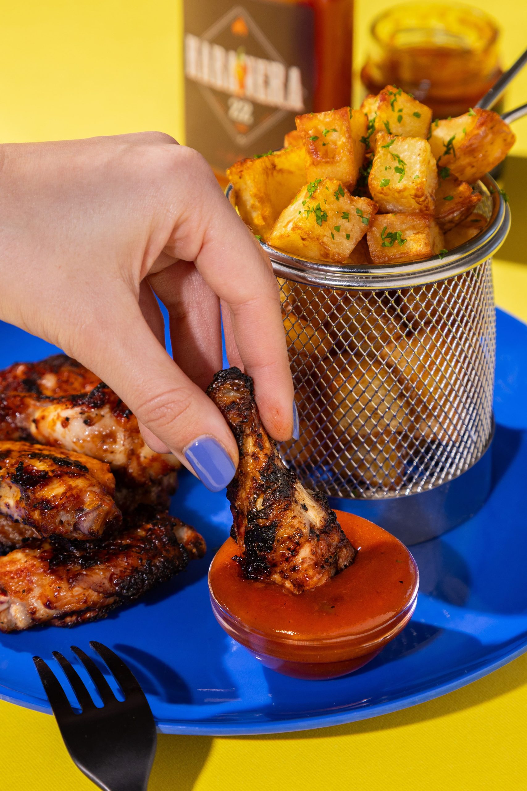
Maxi’s It is the result of forging an identity from the flames. A graphic design project in which everything — typography, colour, composition and tone — had to convey the direct, street-smart and charming character of Max himself, the driving force behind the brand.
The challenge was to create a visual world that broke with the usual conventions of the gourmet world. No bland minimalism: here, the choice was to go for vibrant colours, vintage-style illustrations, bold typographical effects and a playful tone of voice which connects directly with the consumer.
Packaging & Sub-brands
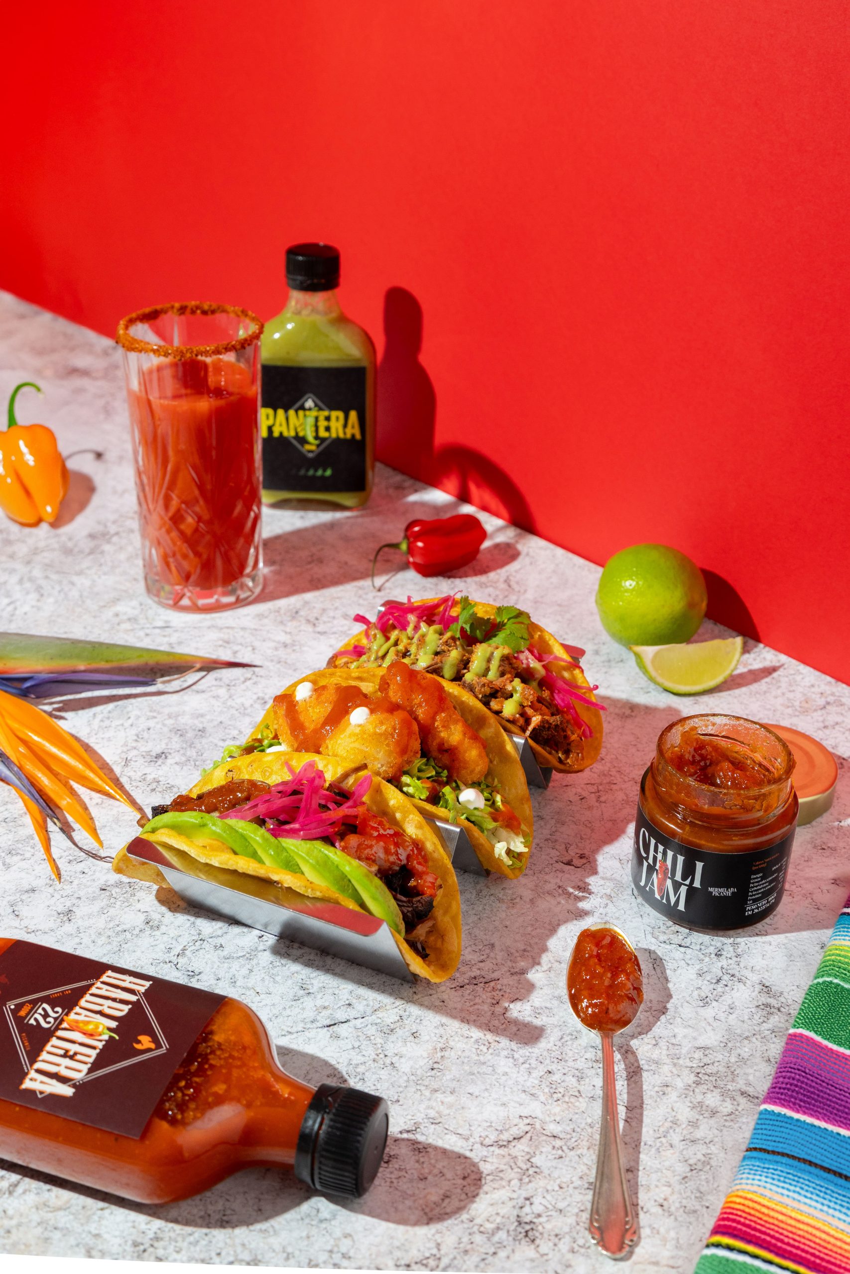
We have created three sub-brands under the Maxi’s umbrella, with bespoke illustrated labels, bespoke colour palettes and a clear visual hierarchy, which makes it possible to distinguish between them without losing their unity.
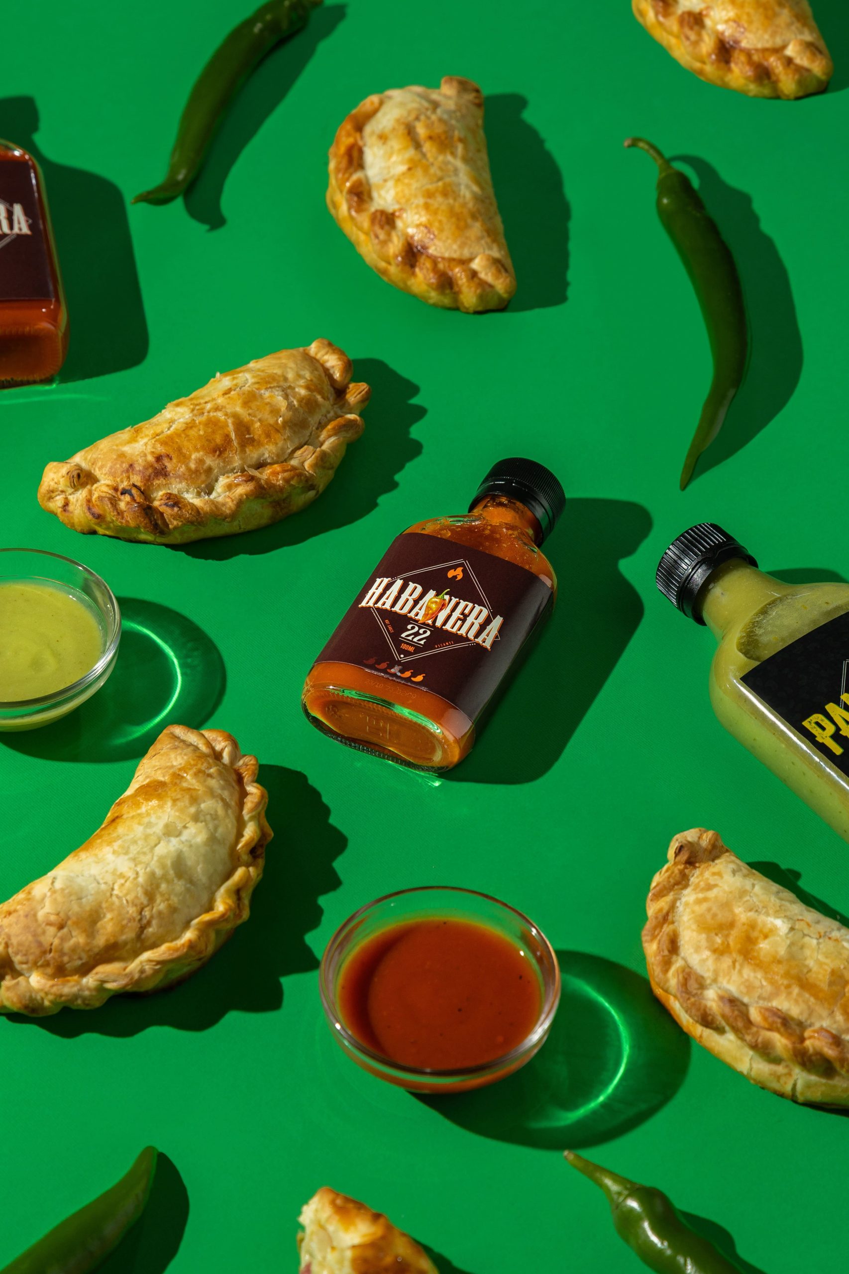
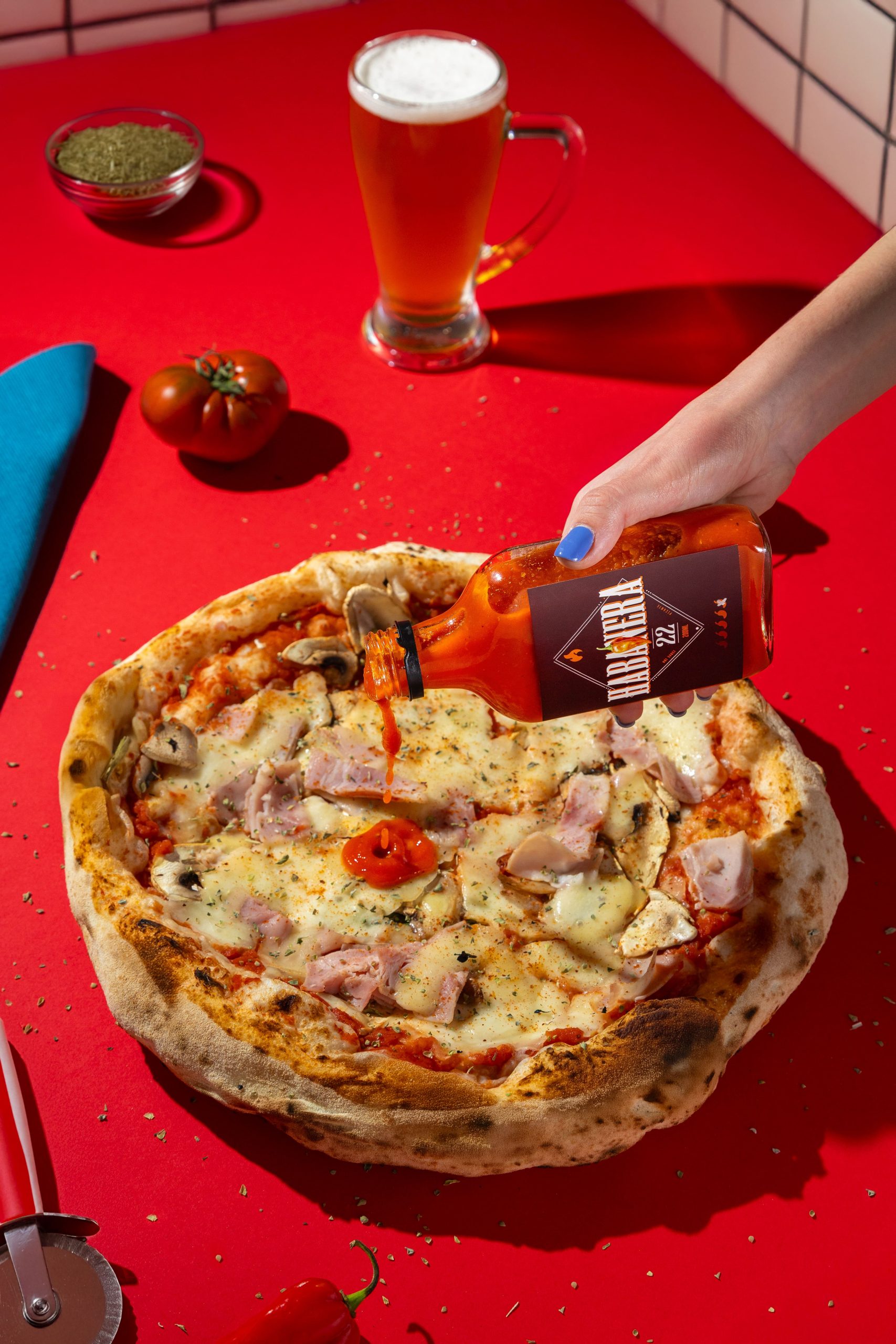
🔥 Habanera
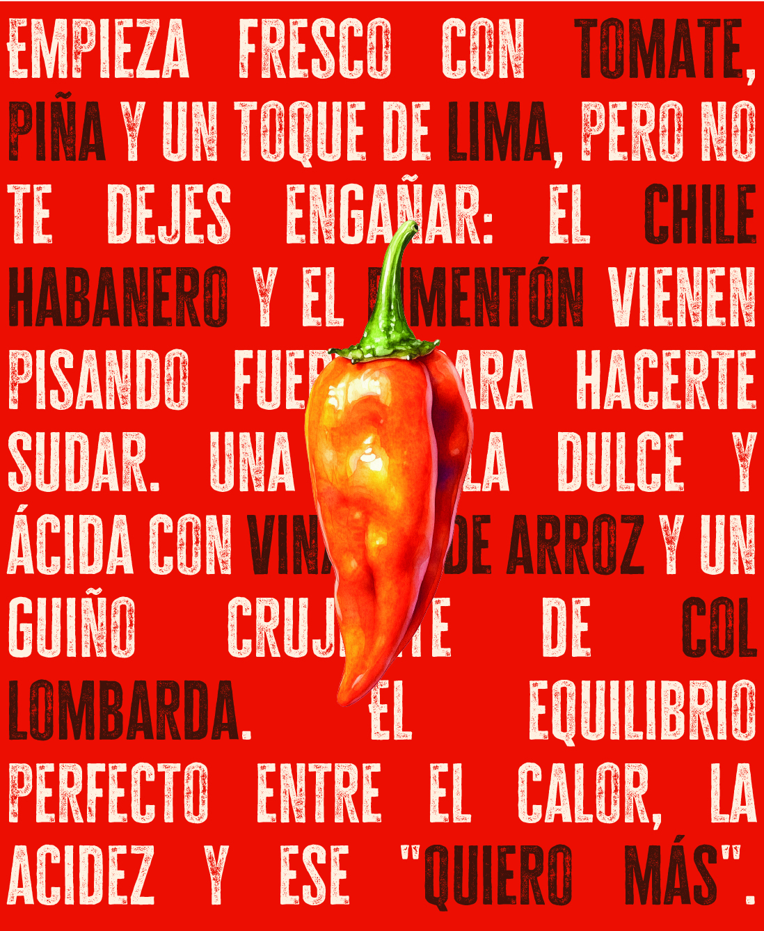
A striking design, featuring rich reds and dynamic compositions. The most extreme and high-energy.
Key points: the use of high-contrast typography and splotches that look like sauce splashes.
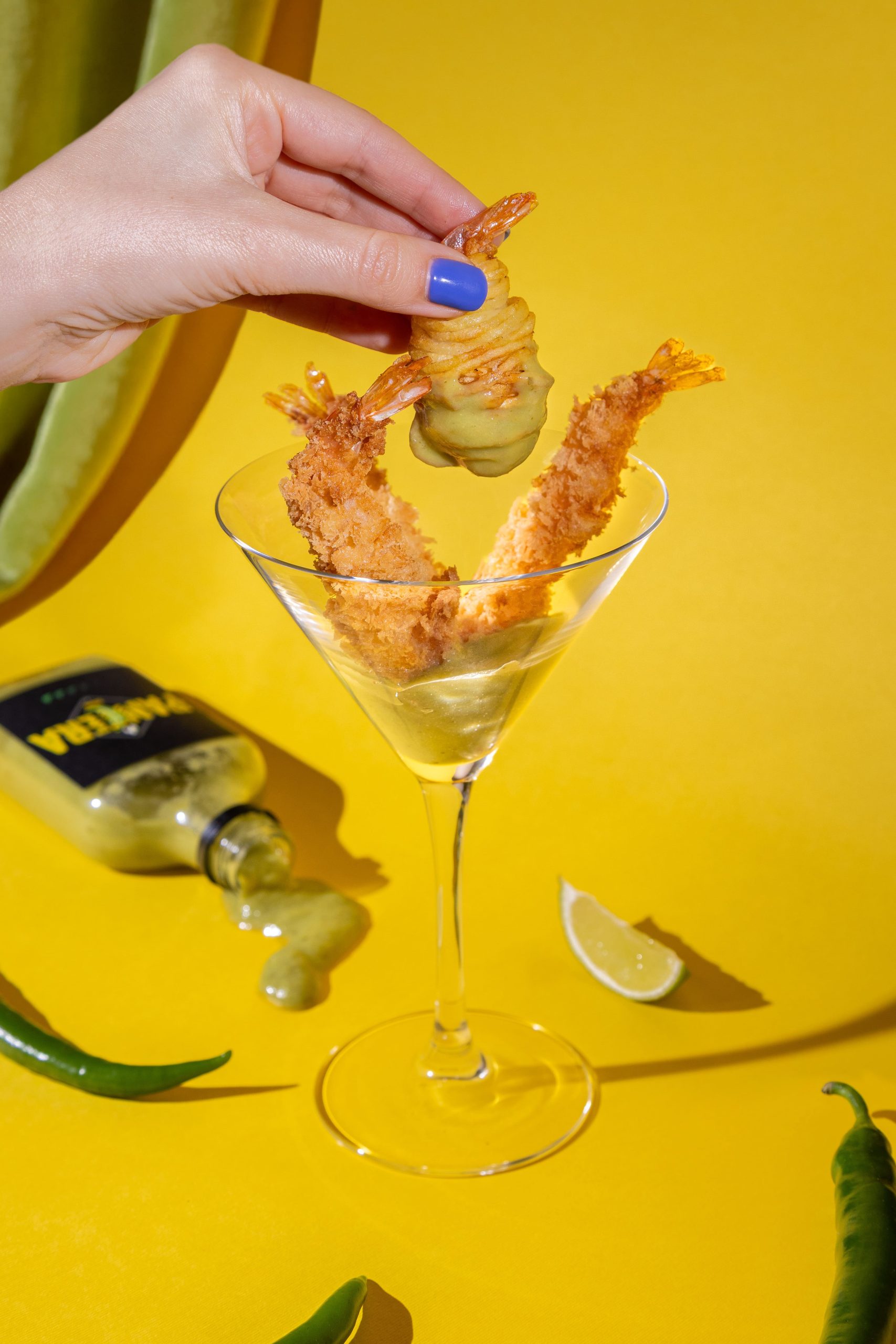
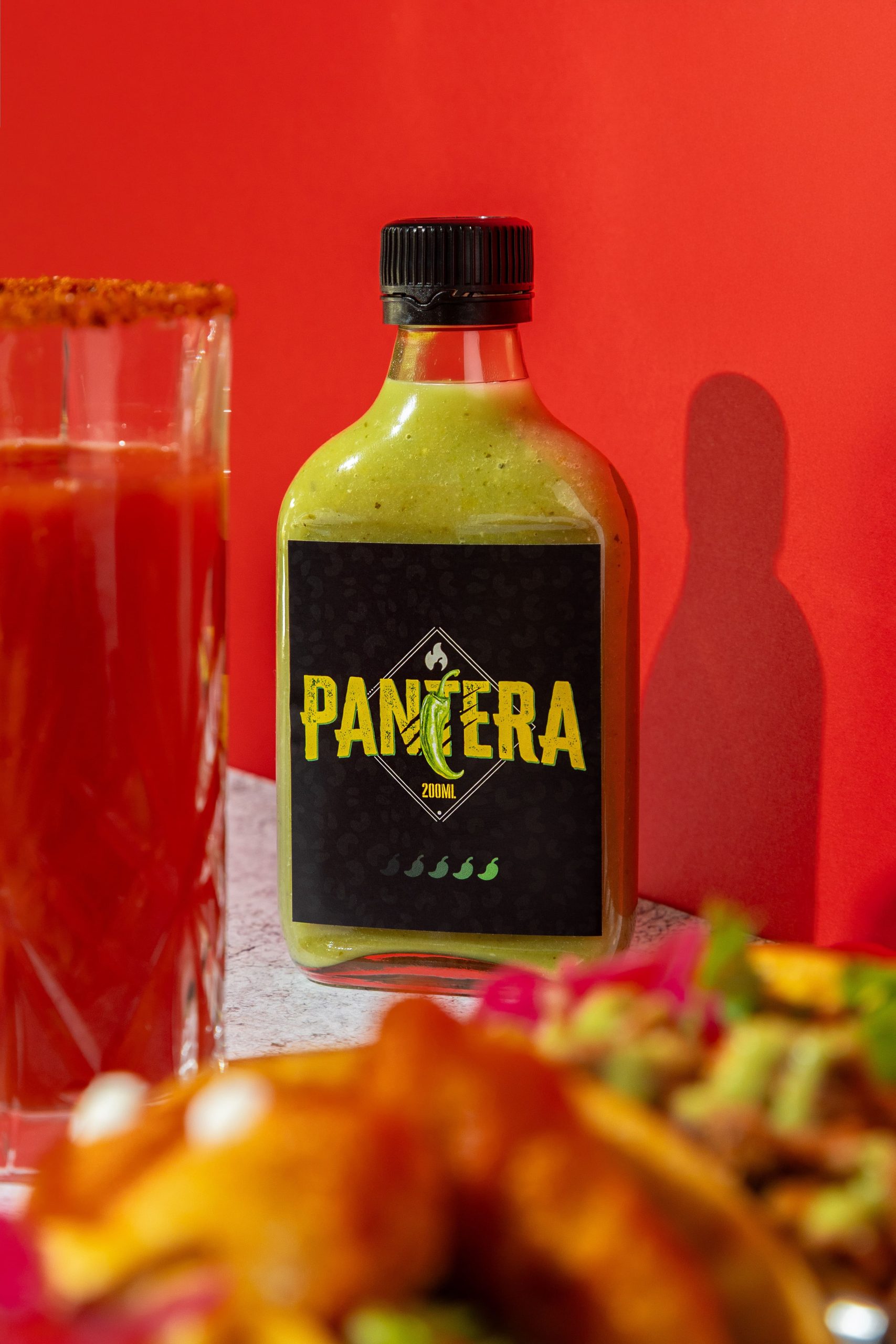
🐆 Panther
Visually more elegant, with a vibrant green colour scheme and an illustrated style inspired by the animal kingdom.
Key points: Engraving-style illustrations, set against bold sans-serif typefaces.
🍅 Chilli Jam
A cleaner, more sophisticated design, in coral with gold detailing on some finishes.
Key points: Refined serif type, subtle illustration, and the use of negative space to convey a sense of lightness.
Result:
A cohesive visual identity with a strong personality, adaptable to physical products, social media and the web. A visual system that literally stands out on the shelf and makes it clear that this brand is not here to go unnoticed.