Maxi's Fire Brand
Creative Direction
Branding
Visual Communication
Web design
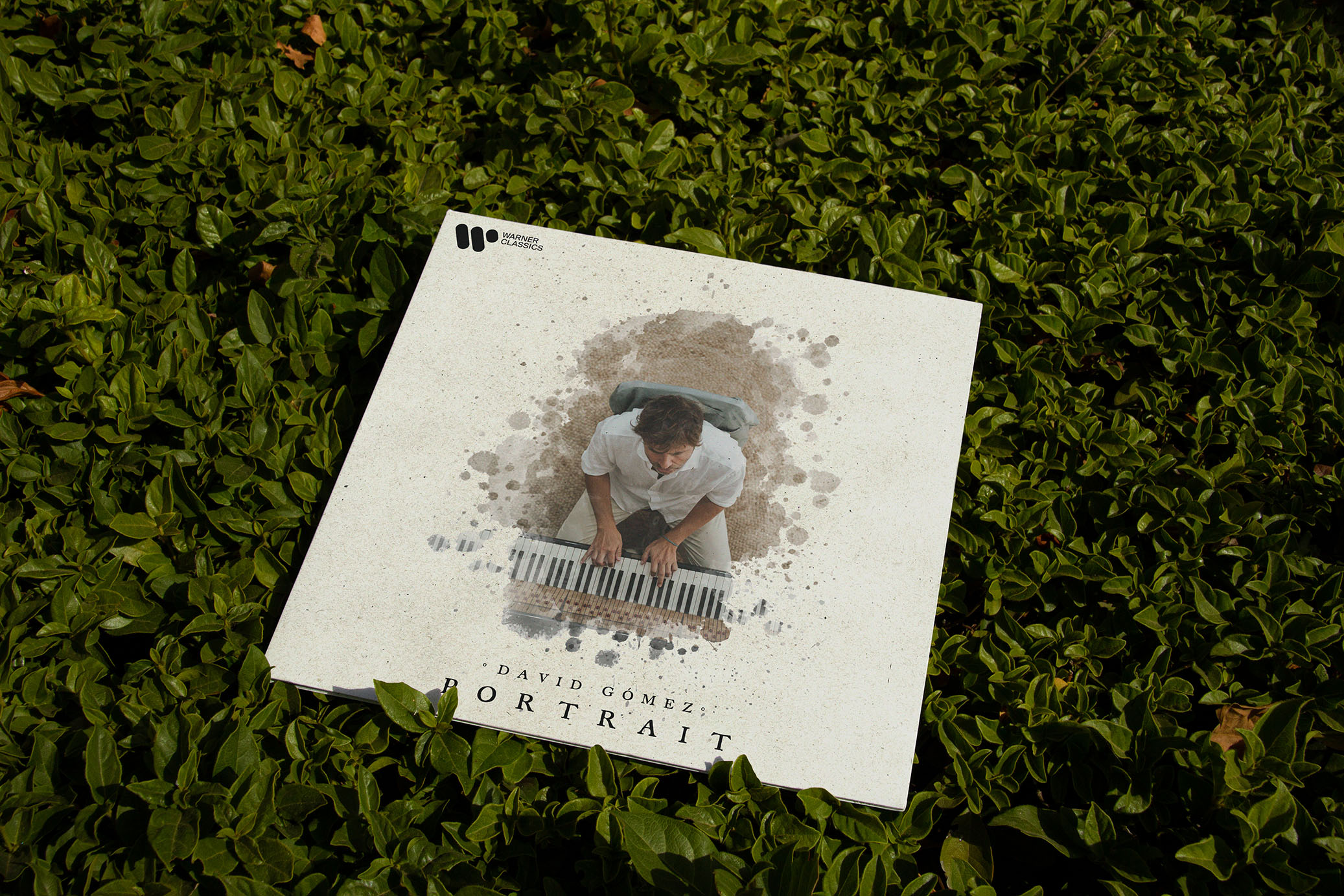
Redesign of the Maxi's brand, a chili sauce that will leave you open-mouthed (and burning). The entire packaging of the sauce has also been designed, which will also adapt to the future brands that are integrated. Product photography by Steven Moreno.

Graphic design, packaging and visual identity for a sauce brand with a lot of personality.
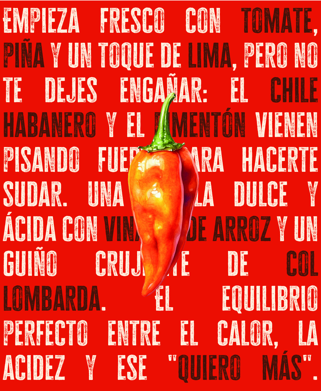
Maxi's is the result of creating an identity from fire. A graphic design project where everything — typography, color, composition and tone — should convey the direct, street and charming character of Max himself, the soul behind the brand.
The challenge was to build a visual universe that would break with the usual codes of the gourmet world. No insipid minimalism: here we opted for bright colors, vintage-style illustrations, bold typographic games and a playful tone of voice that connects directly with the consumer.
Packaging & Subbrands
We created three sub-brands under the Maxi's umbrella, with custom illustrated labels, own palettes and a clear graphic hierarchy, which makes it possible to differentiate them without losing unity.
🔥 Habanera
Explosive design, with saturated reds and rhythmic compositions. The most extreme and dirty.
Key elements: use of high-contrast typography and blotches that simulate salsa splashes.
🐆 Panther
Graphically more elegant, with a vibrant green palette and an animal-inspired illustrated treatment.
Key elements: engraving-like illustrations, contrasting with bold sans-serif typefaces.
🍅 Chili Jam
Cleaner and more sophisticated design, with coral color and gold details in some finishes.
Key elements: refined serif, subtle illustration, and use of negative space to convey lightness.
Result:
A coherent graphic family, with a strong personality, adaptable to physical products, social networks and web environments. A visual system that shouts (literally) from the bookshelf and makes it clear that this brand does not go unnoticed.