Son Gallard Vell Honey
Visual Identity
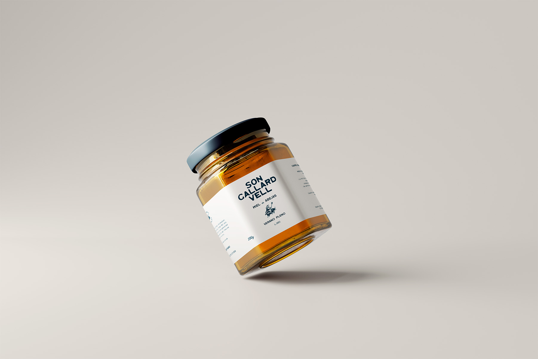
Packaging
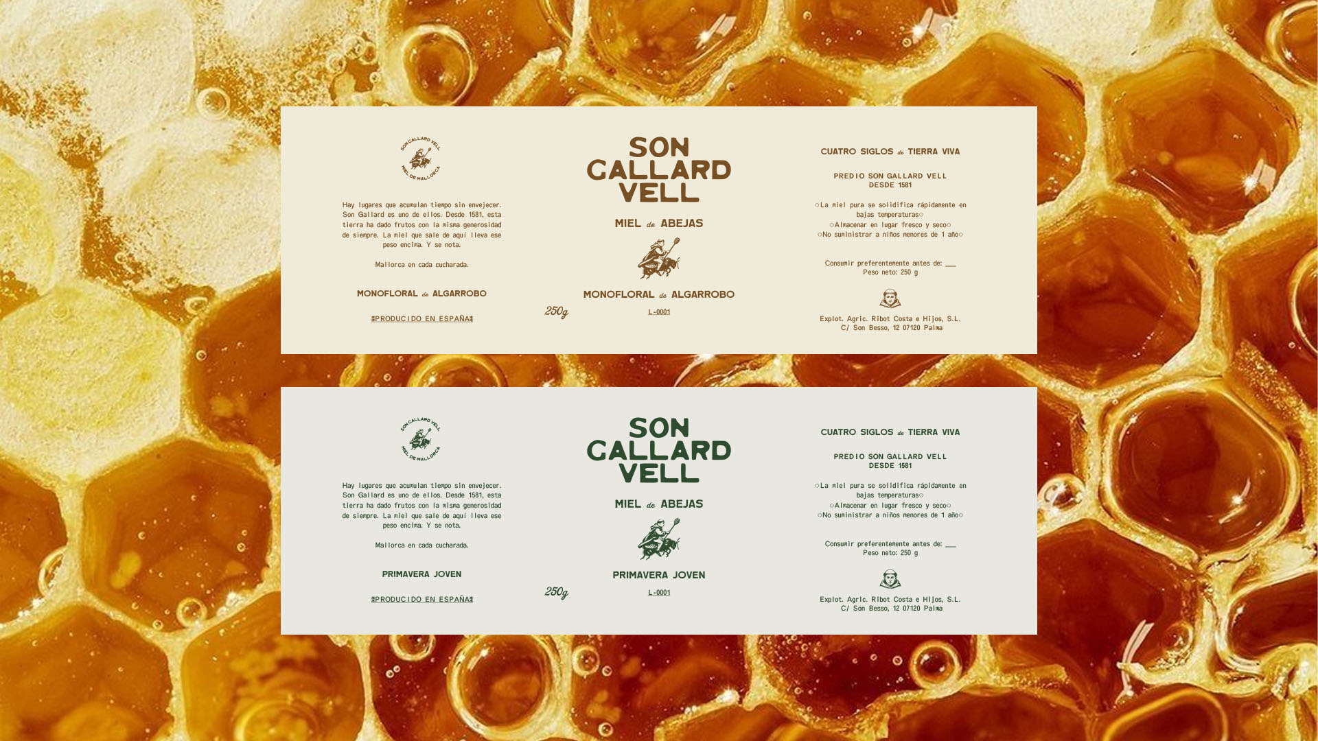
Label Design
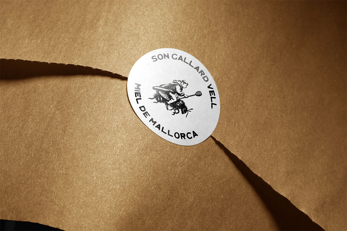
Illustration
Graphic System
Identity and packaging for a Mallorcan artisanal honey with over four centuries of history, from Coll d'en Rabassa to every spoonful.

Son Gallard Vell is a historic estate in Coll d'en Rabassa, founded in 1582 and ceded in 1609 to the Dominican friars of the Convent of Santo Domingo in Palma. For over two centuries, the friars cultivated their land—vineyards, olive trees, almond trees—and kept beehives as part of their productive life. This connection between the religious order, the Mallorcan land, and the bees is the thread that links four centuries of history with today's product.
The brief was to create an identity that told this story without explicitly explaining it. For the design to speak before words.
We developed the complete identity system and labels for each honey variety—Carob Monofloral, Young Spring, Full Summer—each with its own color palette within the same visual universe. The central piece of the system is the illustration of the Dominican friar riding a bee: an icon that compresses four centuries of history into a single stroke, with just enough humor not to take itself too seriously. The blocky, bold typography anchors the brand in the contemporary, while the cream background and classic label composition pay tribute to tradition.
"There are places that accumulate time without aging. Son Gallard is one of them." That phrase, which the clients already had, summed it all up. Our job was to make the design worthy of it.